Commonwealth Bank · 2014–2017
Staying ahead of bills, inside the payment moment
BPAY View lived in a separate sign-up flow that people didn’t trust or couldn’t find, and paying a bill happened somewhere else entirely. It wasn’t delivering a return for the business, and Australians were paying late fees on their bills.
The 20-second version
My roleMobile UX Designer
- Signing up for BPAY View and paying a bill were two separate flows, so people didn’t find it or trust it.
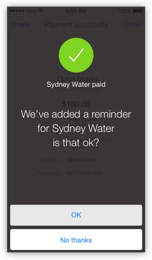
- I designed what happens straight after someone pays a bill. The app asks if they’d like a reminder next time, and it’s their call.
- Since launch in late 2016, bills paid via BPAY View grew more than 700%, and primary bank retention rose 10 points.
Impact
Bills paid via BPAY View since launch
Indexed, with launch as 100. That means fewer missed payments, fewer late fees and less money stress.
The problem
Why people didn’t sign up
People didn’t understand the benefit, and signing up took effort. They couldn’t see what was in it for them, so they didn’t sign up.
My part
UX for the payment moment
I owned the mobile app UX, exploring the point right after someone pays a bill, where the app offers to add a reminder for that biller. That made setting up BPAY View a natural next step instead of a separate sign-up.
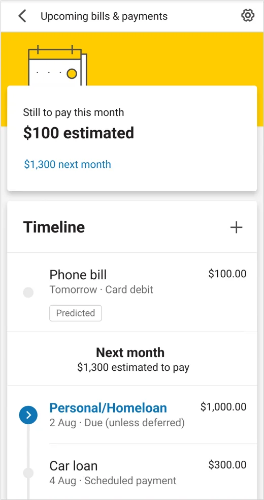
I worked collaboratively with a team on the wider Better Bill Experience, which launched in late 2016.
Research & testing
Uncertainty equals drop-off
We tested different wording and trust signals to find what removed doubt at each step.
Design
Finding the right moment
Mapping the journey showed where sign-up fitted naturally: straight after paying. The confirmation then made it clear exactly what had been set up.
The design drew on the endowed progress effect: people are more likely to follow through when part of the work is already done for them. So instead of asking people to set up a reminder, the app set it up and simply asked, “Is that ok?”
Strategy
Earning trust by giving control
We worked with legal and compliance on an opt-in model, retired the old sign-up flows, and did a lot of stakeholder negotiation.